
shapes
Twelve shapes, ten styles, your colours
A skin is a shape, a style and a brand colour, with light, dark and automatic modes. Mix them freely, start from one of 22 ready skins, or give a course category or a cohort a skin of its own.
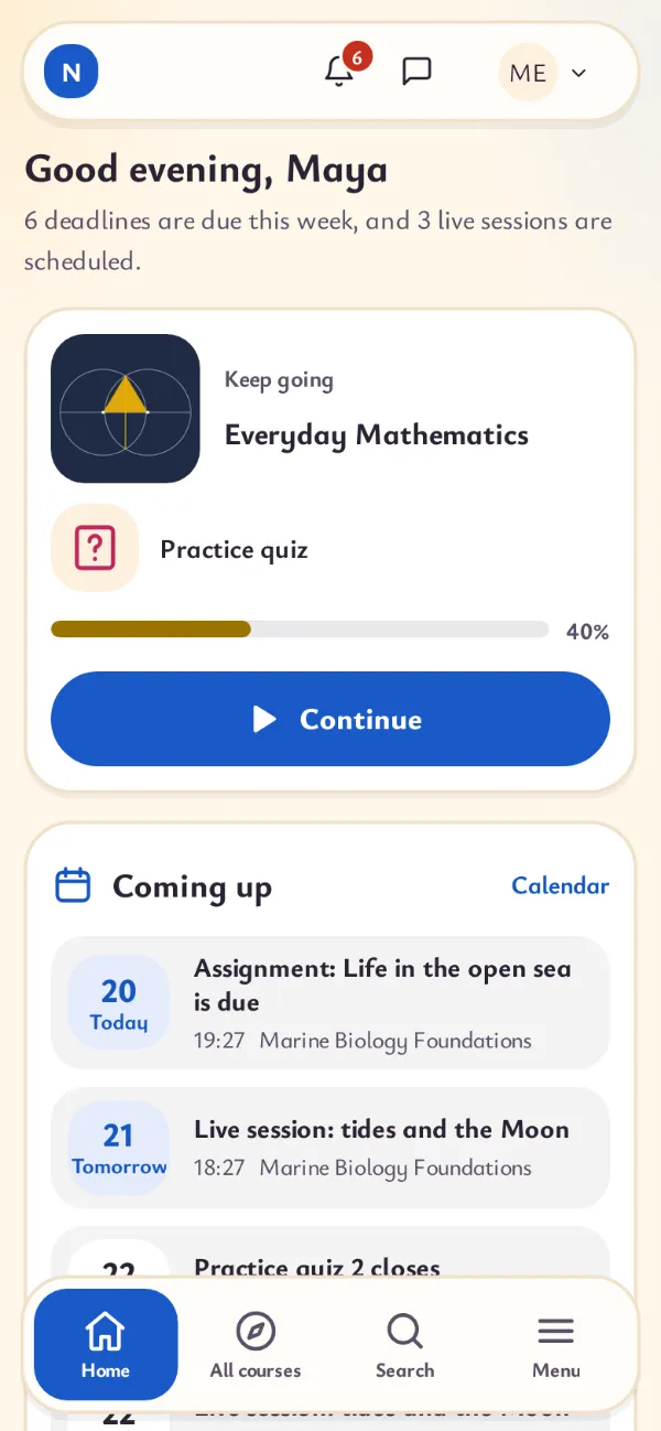
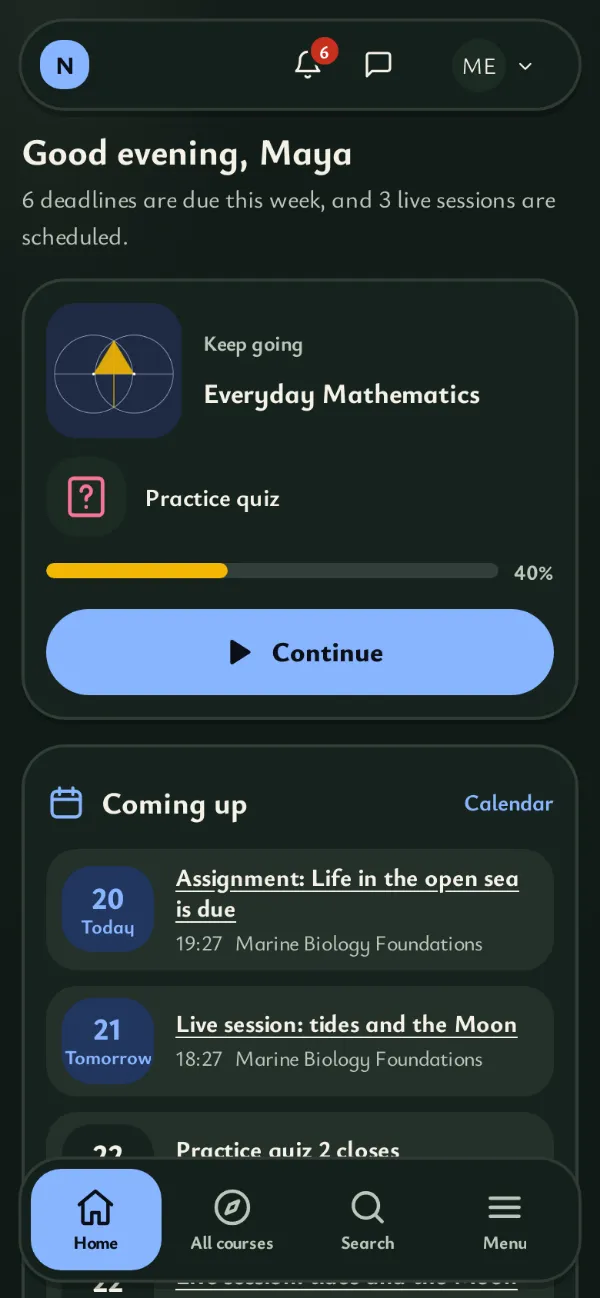
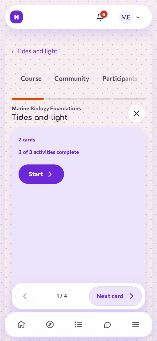
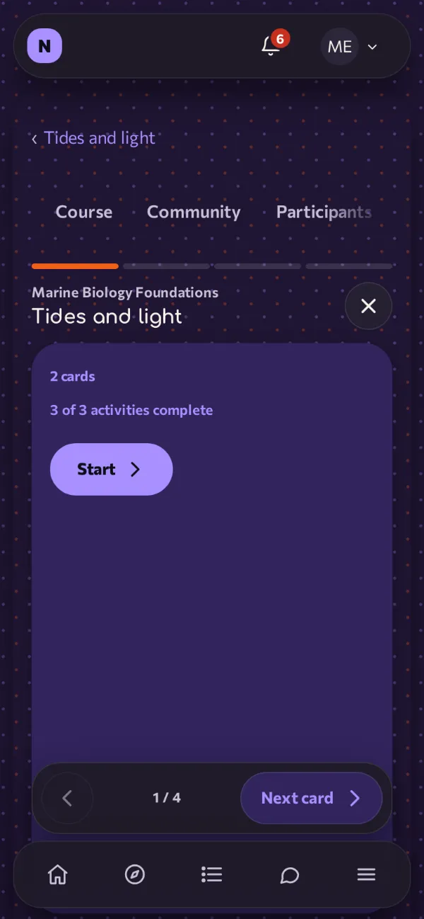
Drag the handle on any screenshot to compare the light and the dark appearance.
12shapes
Light and dark, side by side
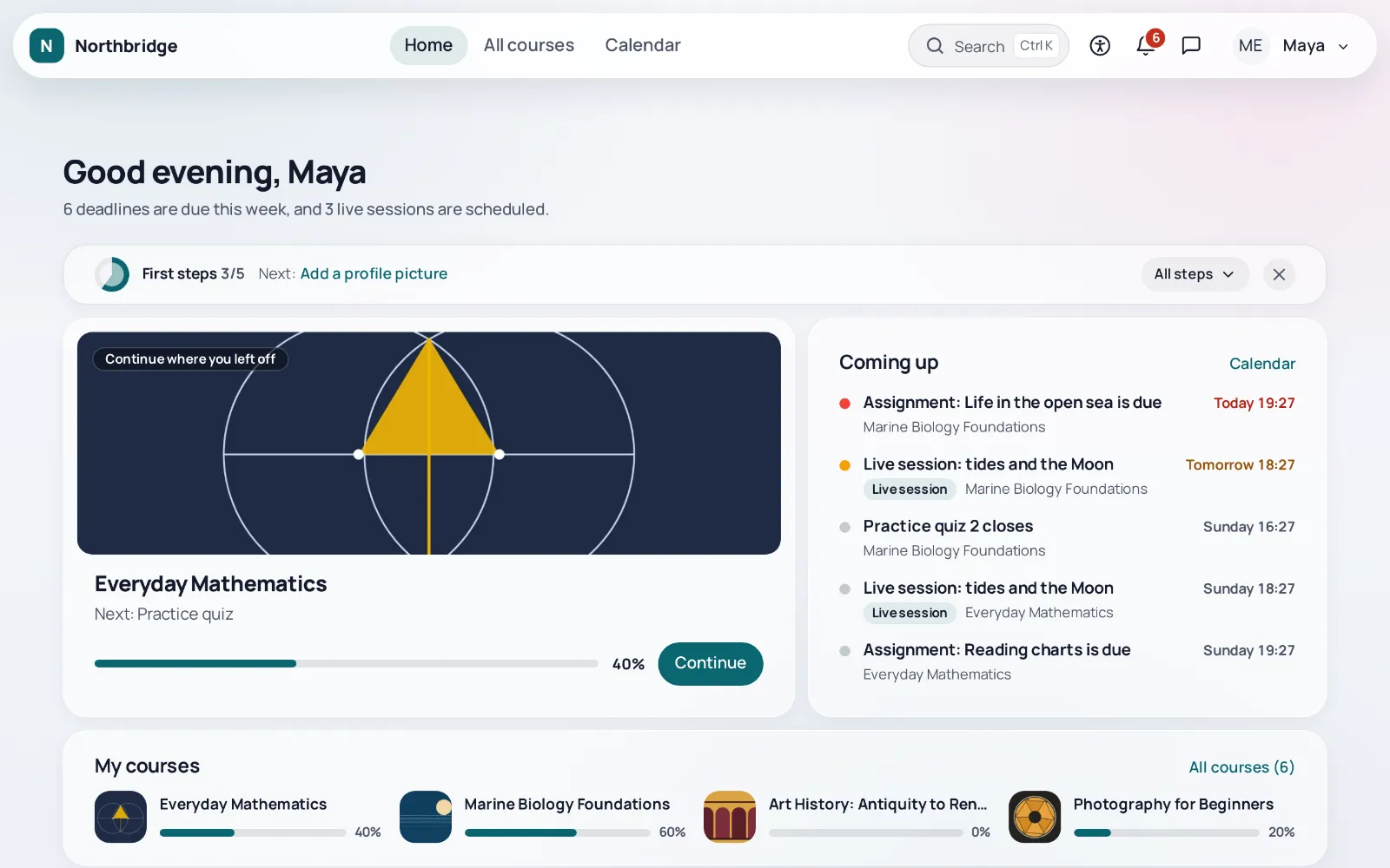
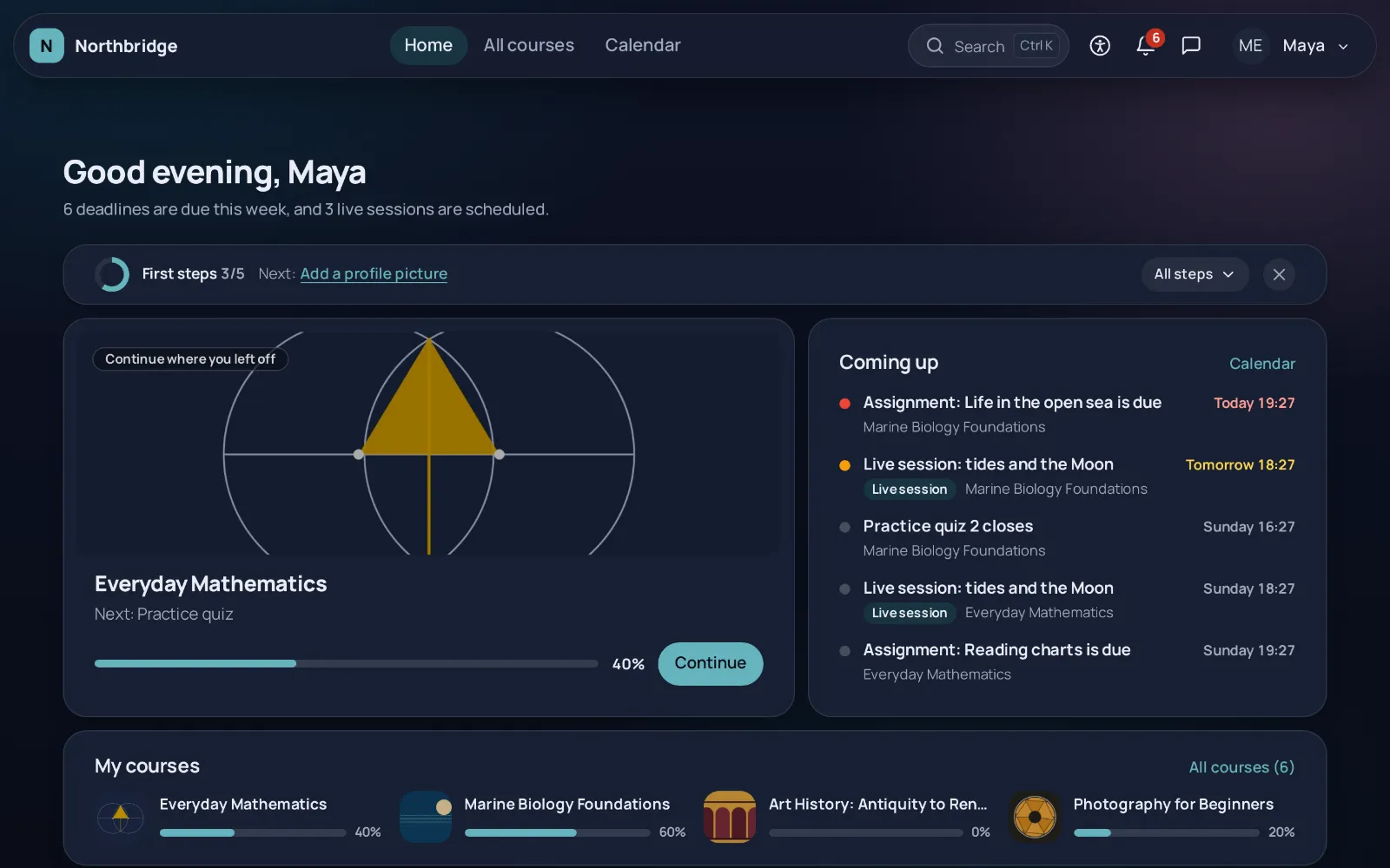
01 Island
The navigation floats in a rounded bar at the top of the page, with space around it. The calm default.
Ready skin: Letstudy, with the Glass style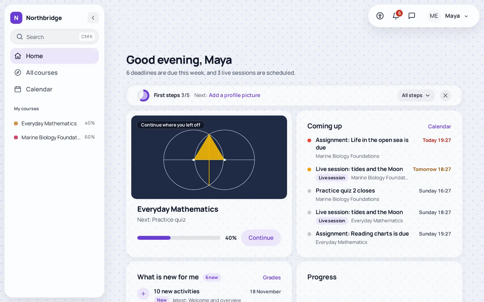
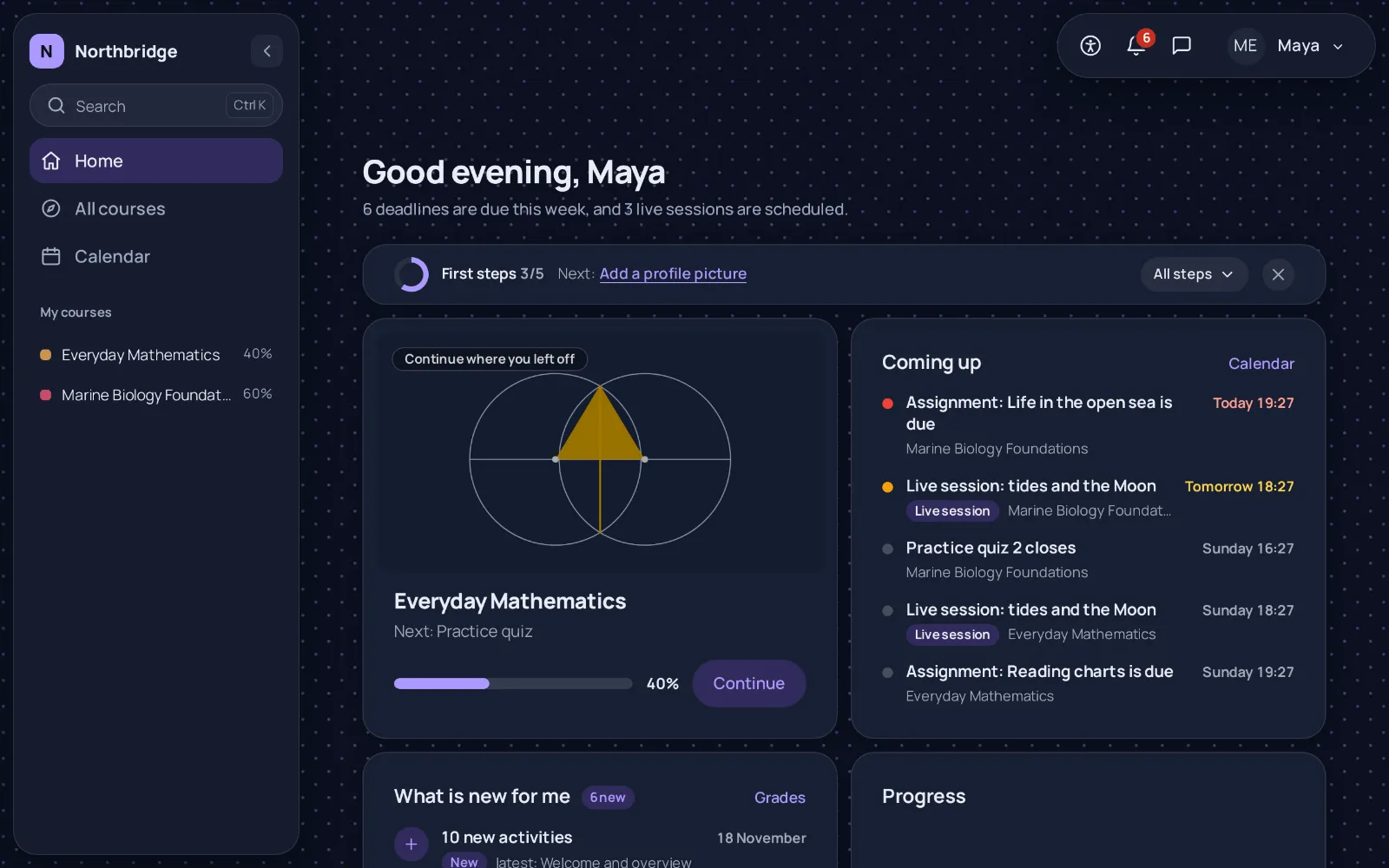
02 Sidebar
The navigation moves to a floating side column that folds into icons and lists the courses of the learner with their progress.
Ready skin: Studio, with the Glass style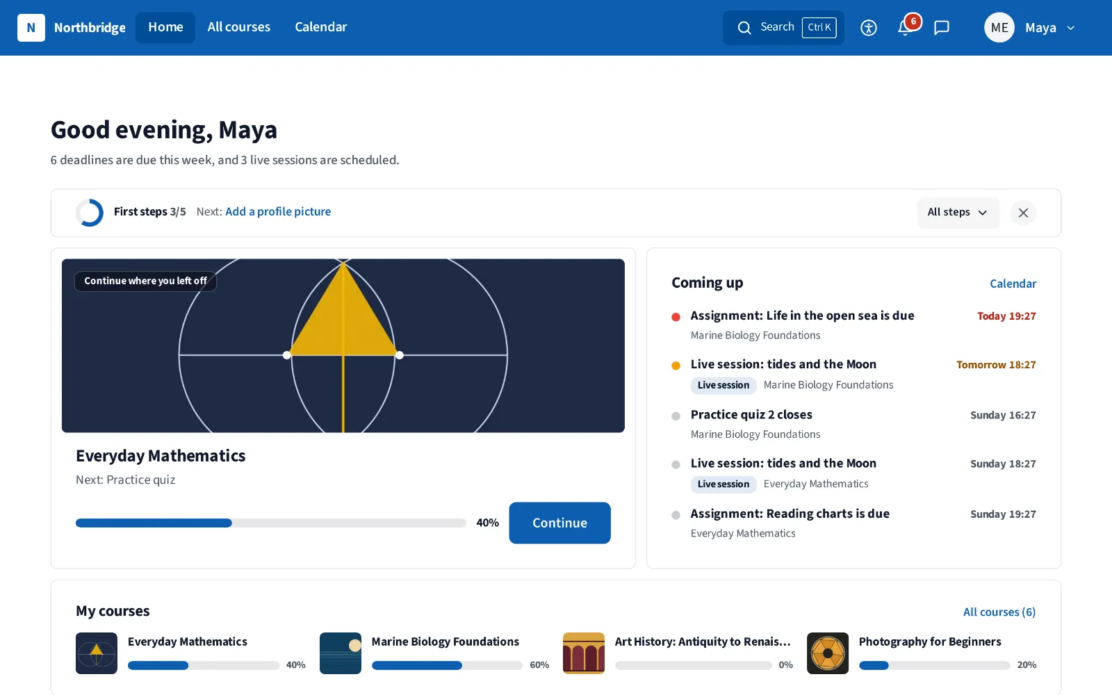
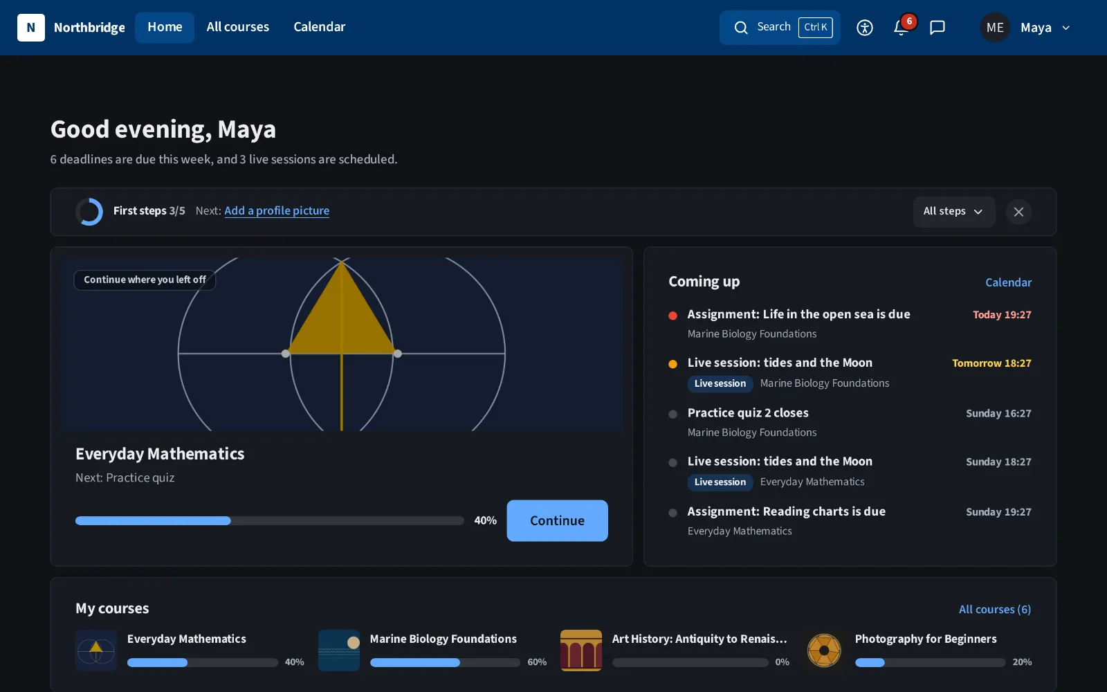
03 Classic bar
A solid, full width bar fixed to the top, with the tabs next to the logo. Close to what Moodle users already know.
Ready skin: Public body, with the Clean style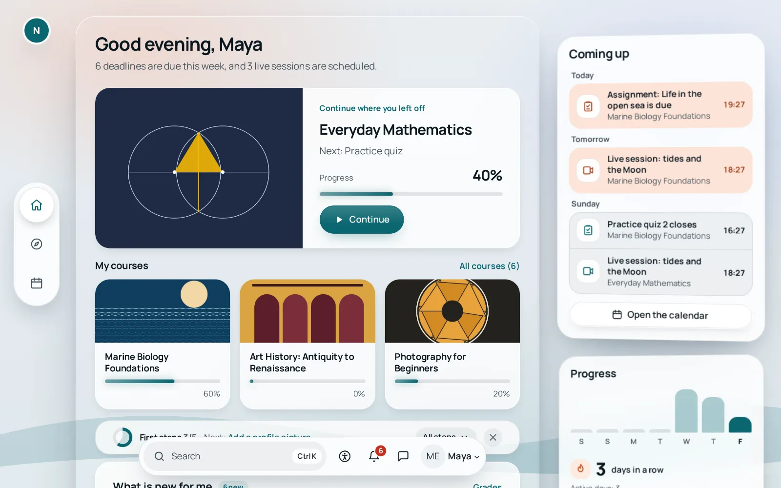
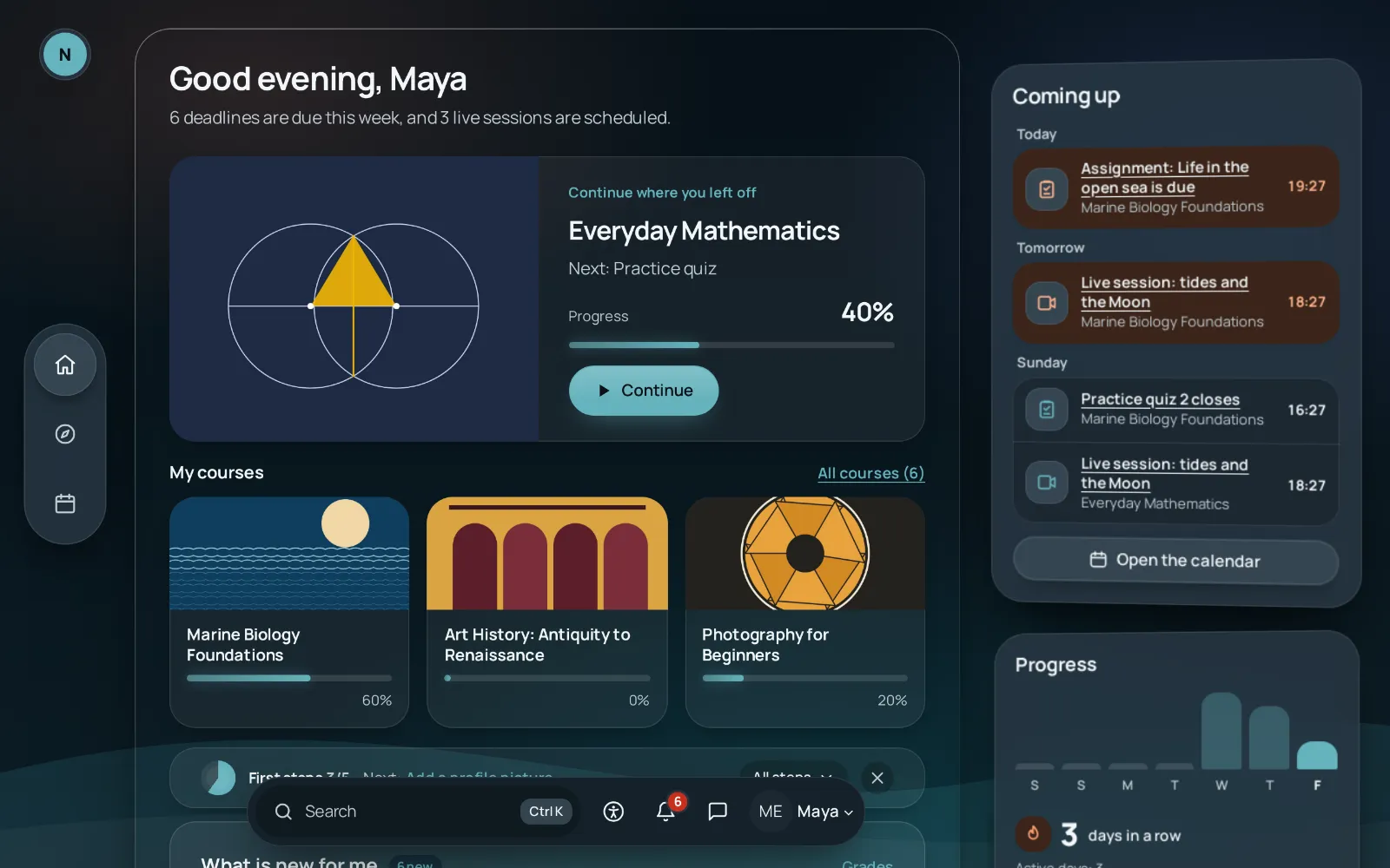
04 Depth
Content opens in floating windows over a calm background. The navigation stays outside the window, in a vertical tab bar and a toolbar.
Ready skin: Depth, with the Depth style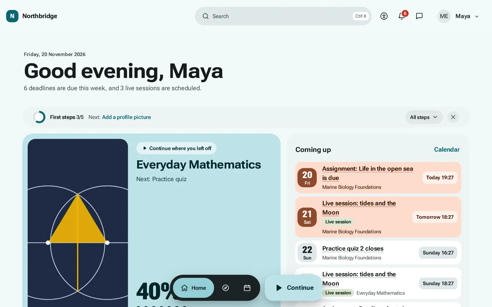
05 Mosaic
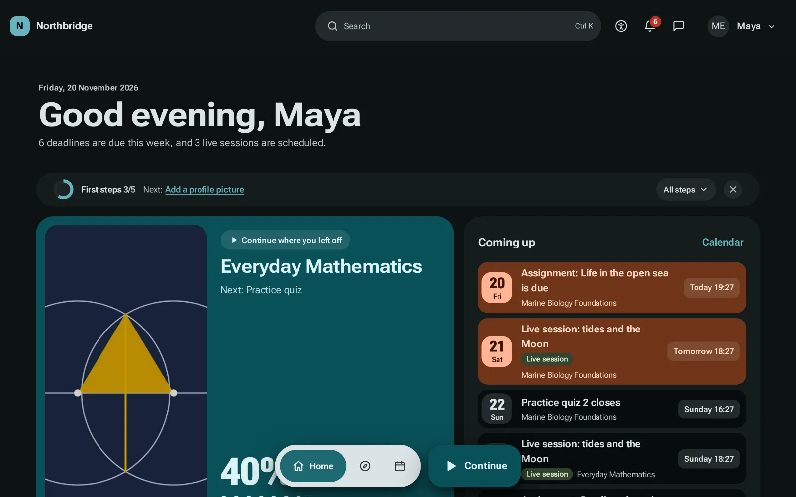
The dashboard and the course page become tiles of different sizes, and the navigation moves to a floating bar at the bottom with its own Continue button.
Ready skin: Mosaic, with the Mosaic style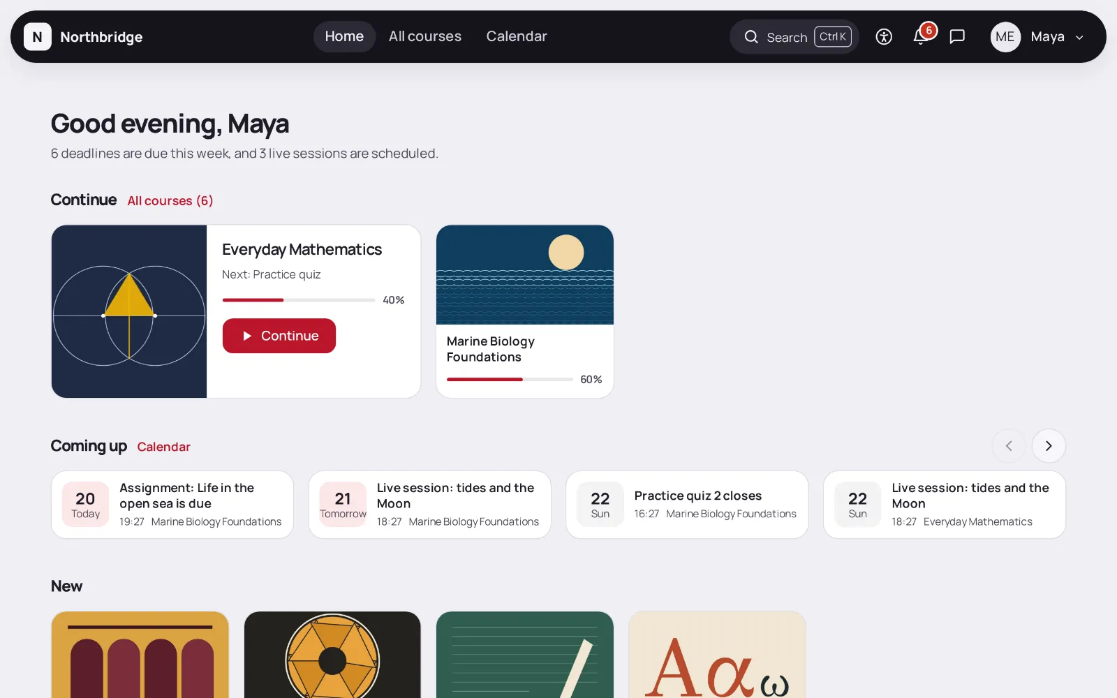
06 Shelf
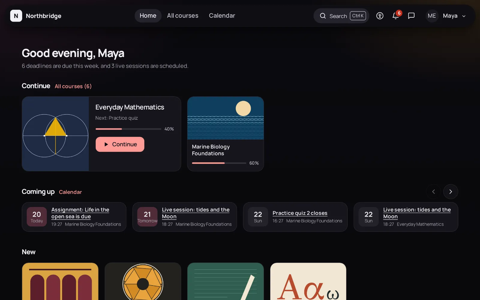
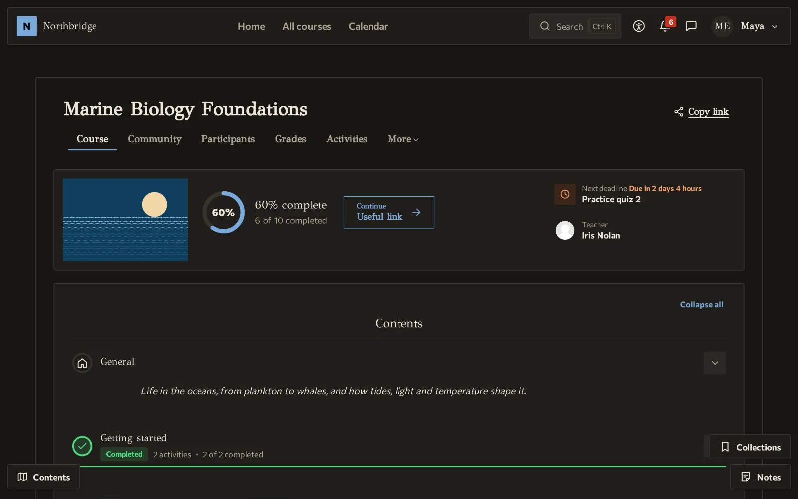
Courses sit on shelves that scroll sideways: Continue, Coming up, New and one shelf per category. A course opens as a list of episodes.
Ready skin: Shelf, with the Night style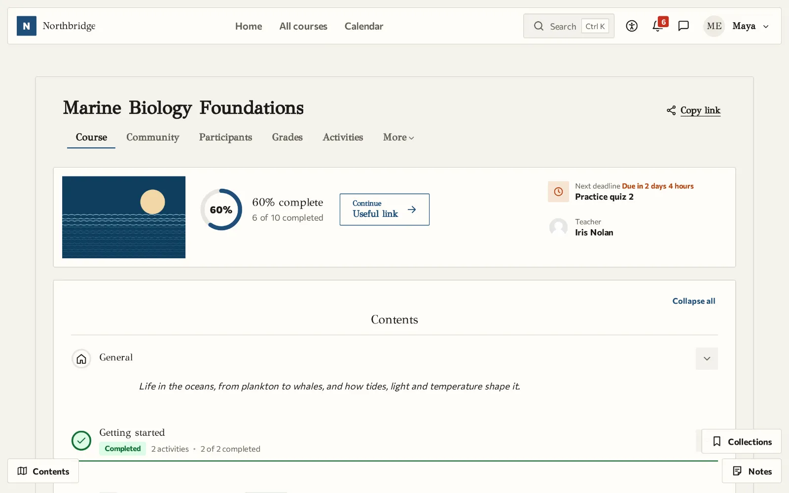
07 Book
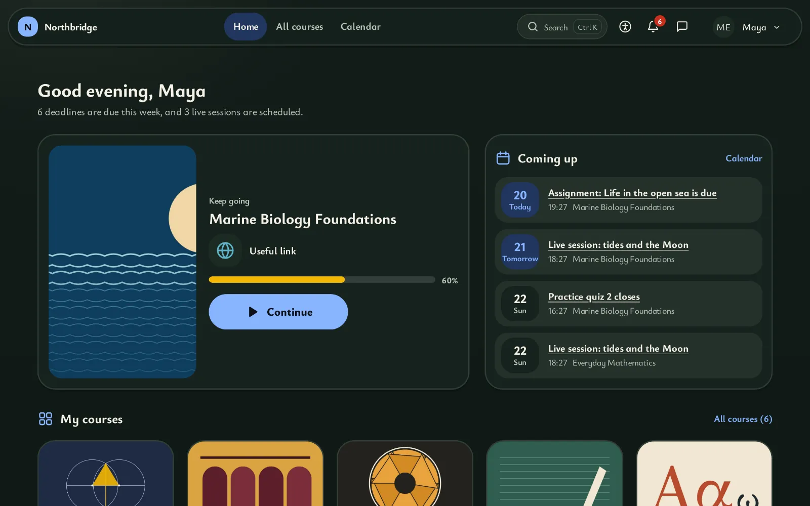
A course is read like a book, one page at a time, with Previous and Next, the arrow keys or a swipe. The dashboard keeps a bookmark where reading stopped.
Ready skin: Book, with the Paper style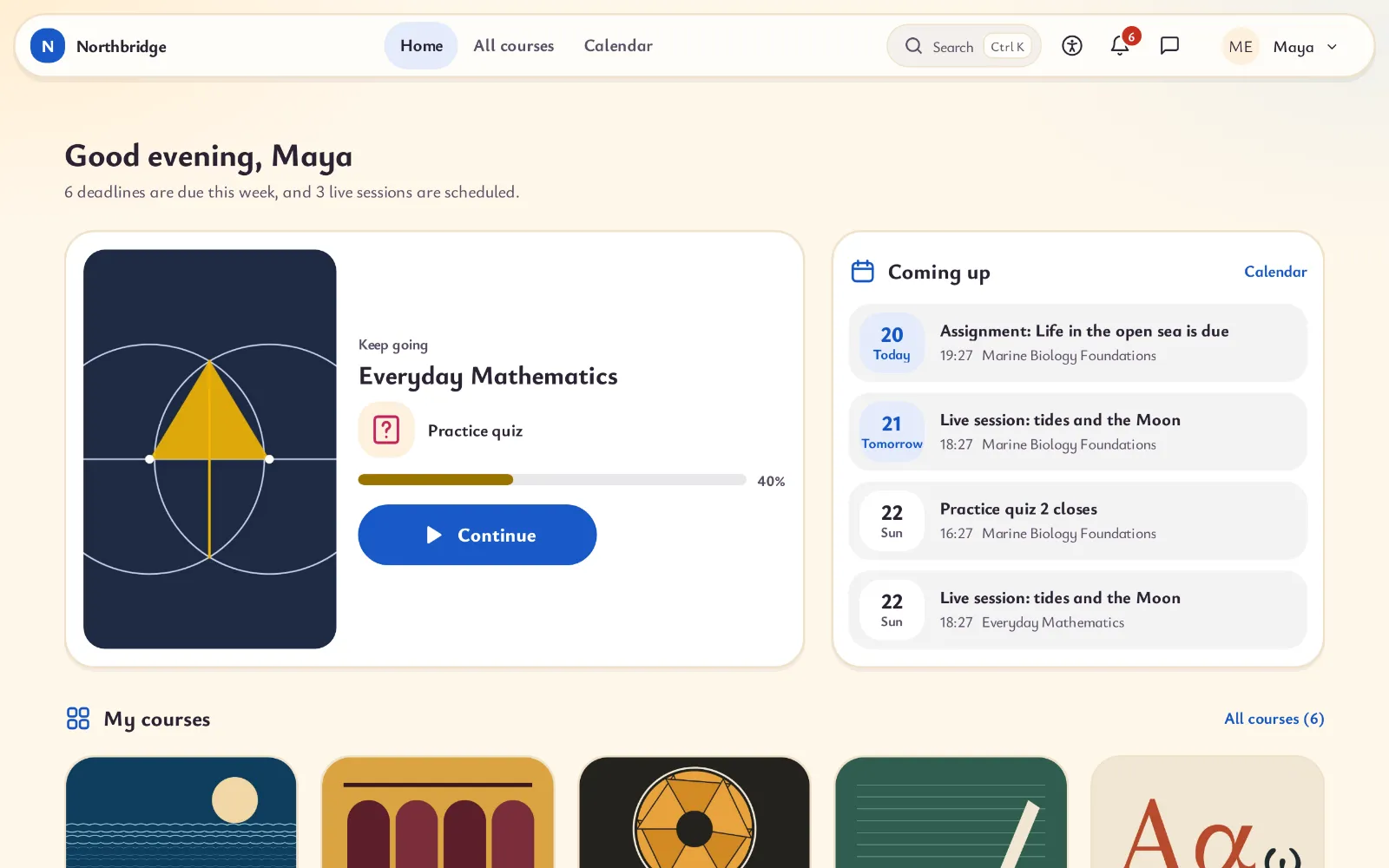
08 Young learners
Large tiles with icons and little text, very large buttons and a phone bar of four labelled icons, for children who are still learning to read.
Ready skin: Young learners, with the Chalk style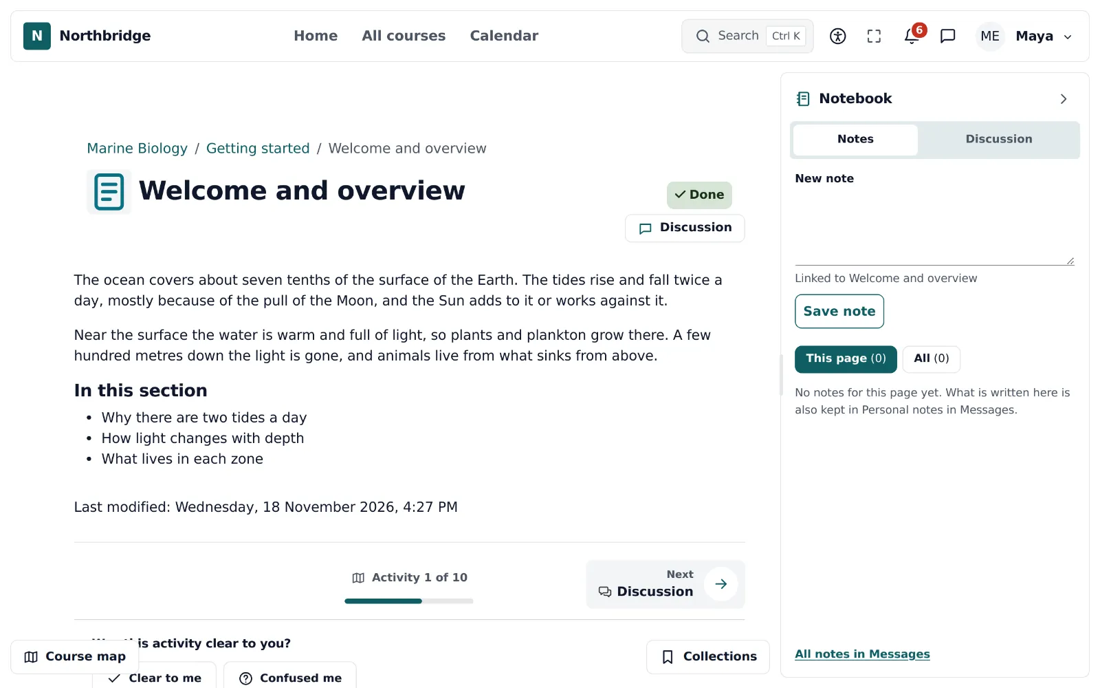
09 Notebook
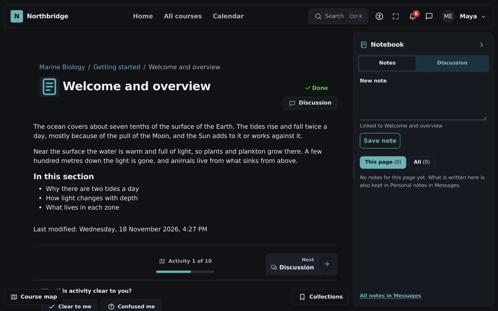
Content on the left and a panel on the right that stays open while learners move on: their notes, the discussion of the course and, when the site has an AI provider, questions about the page.
Ready skin: Notebook, with the Clean style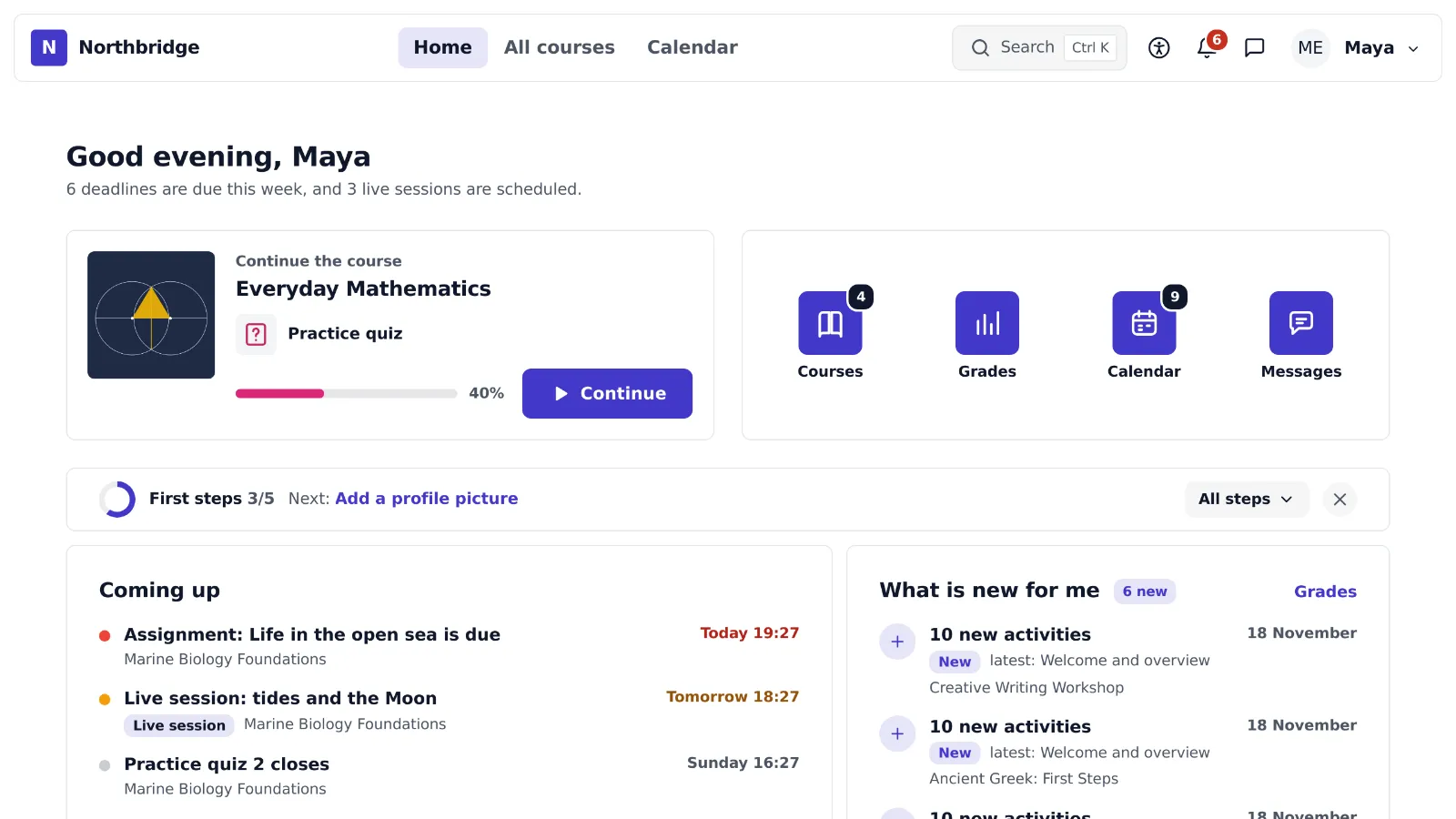
10 Portal
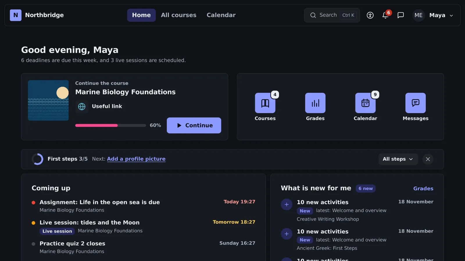
The home looks like the home screen of a phone: one card that continues the last course and icons for courses, grades, calendar and messages, each with a badge of what is new.
Ready skin: Portal, with the Clean style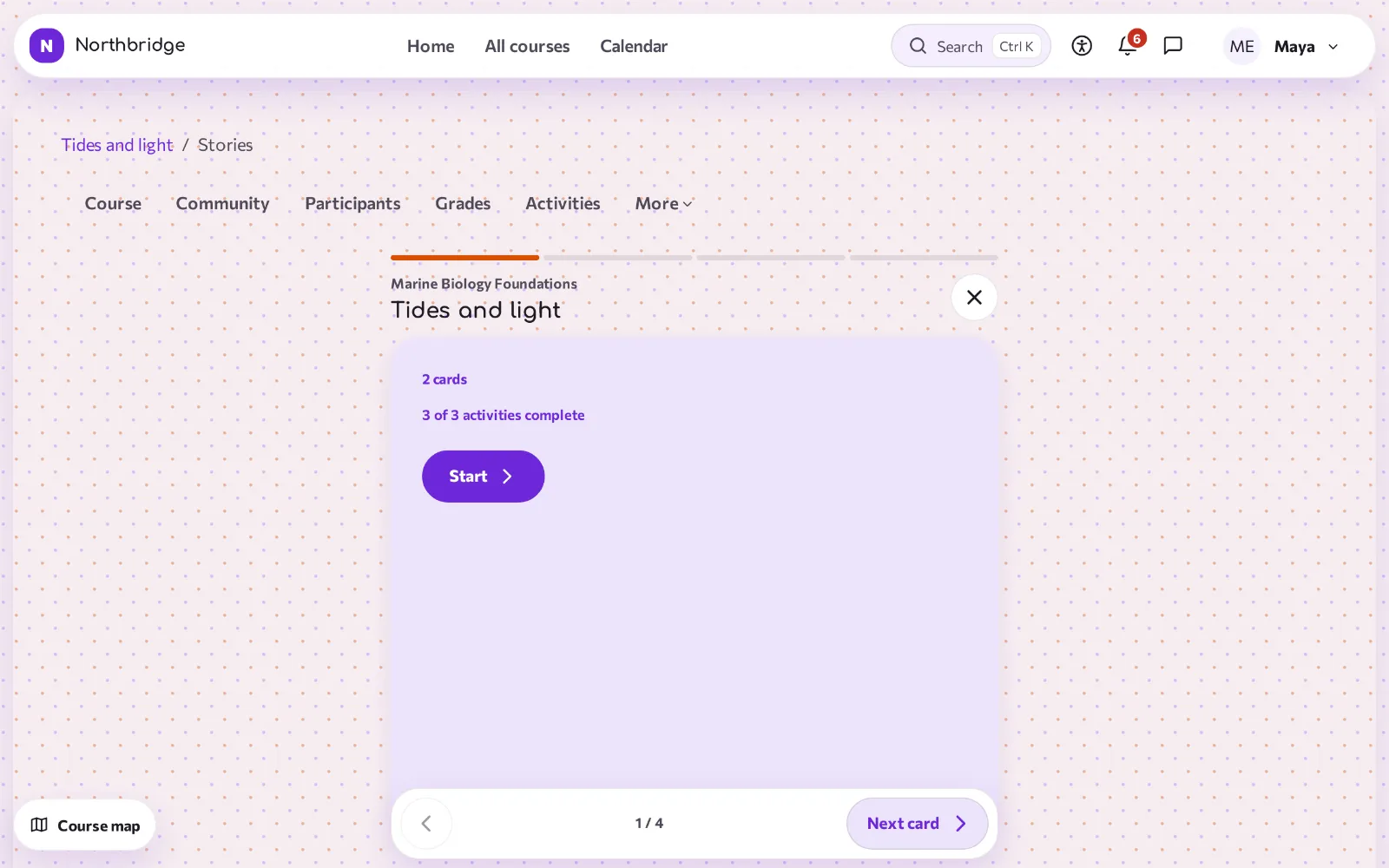
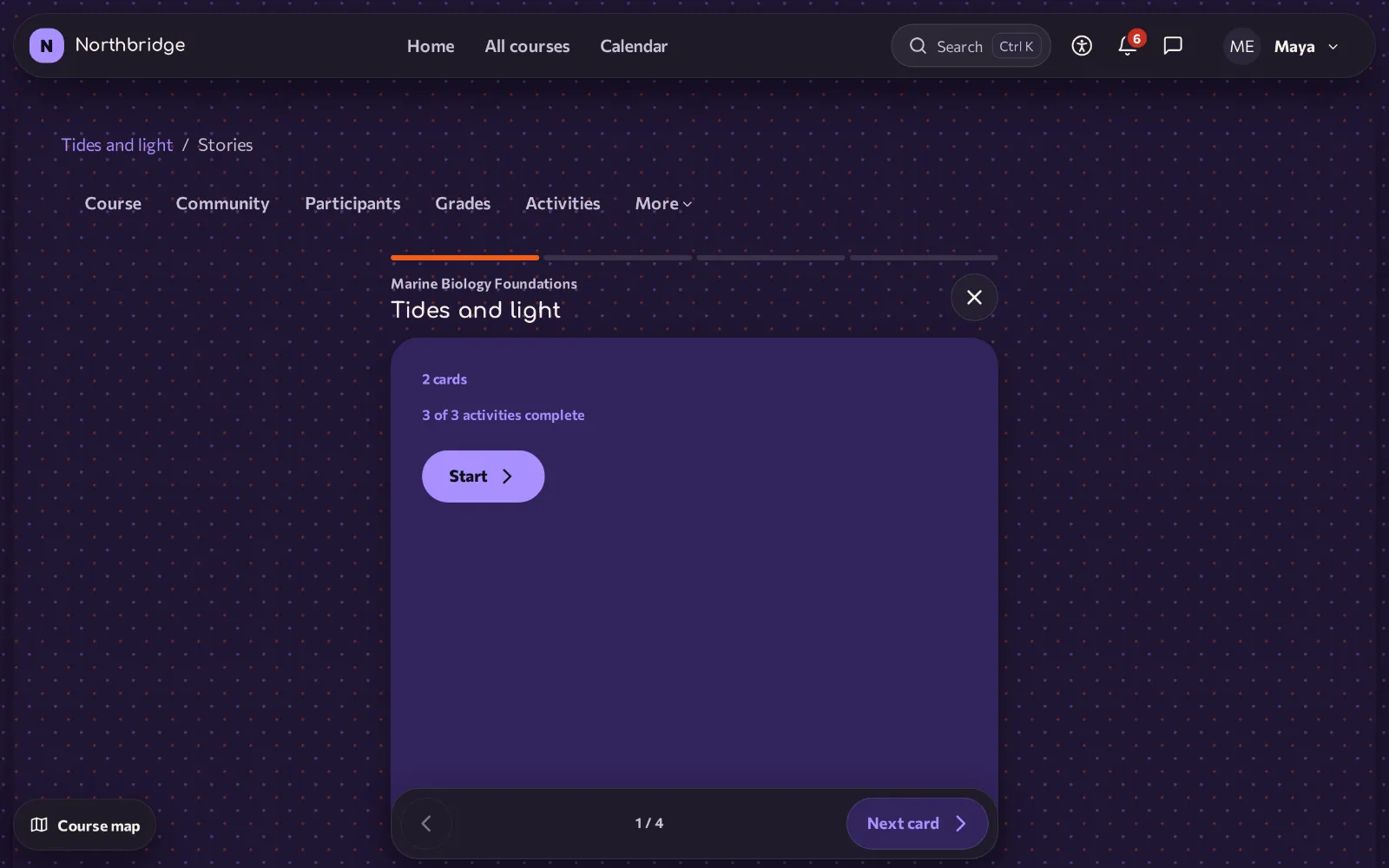
11 Stories
Each section becomes a short story of tall cards, one at a time, with a short question at the end. The cards change with buttons, arrow keys or a swipe, never by themselves.
Ready skin: Stories, with the Lively style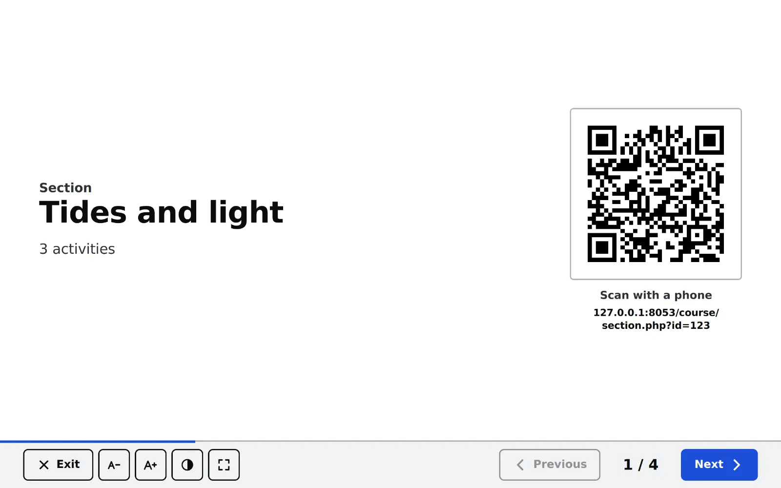
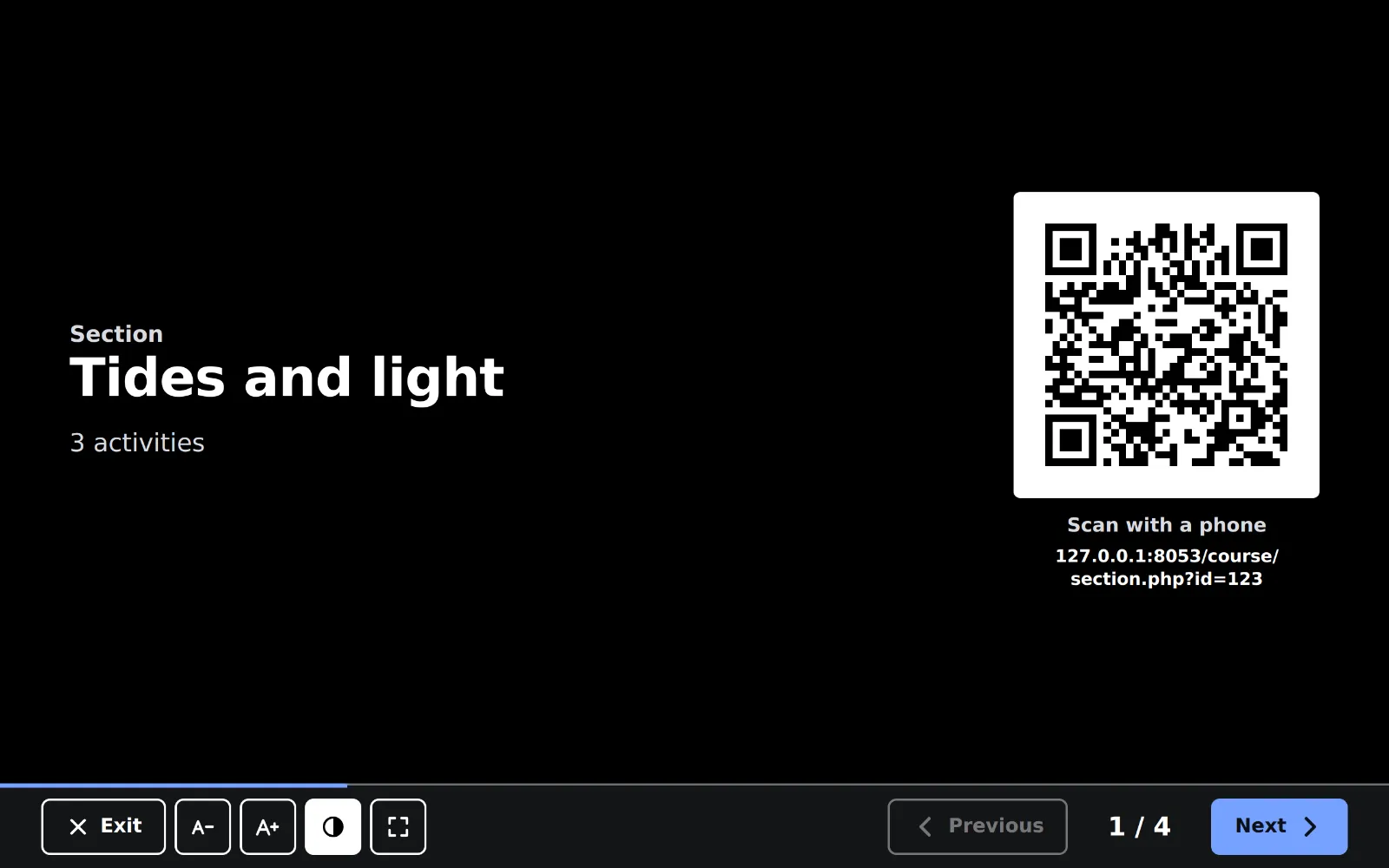
12 Classroom
For lessons with a projector or an interactive whiteboard: the teacher presents the course one item at a time in very large type, and a QR code opens the same item on the phones of the learners.
Ready skin: Classroom, with the Clean style
10styles
Ten styles for any shape
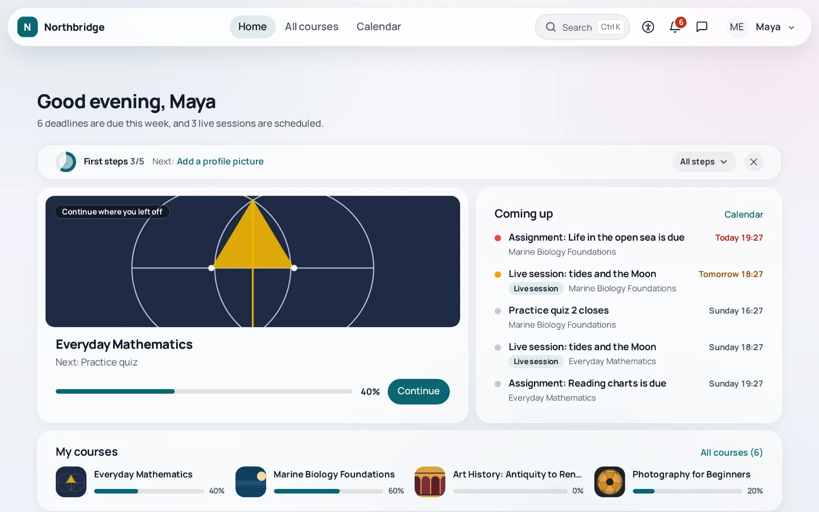
Glass
Translucent cards over a soft wash of the brand colour, round corners and Manrope headings.
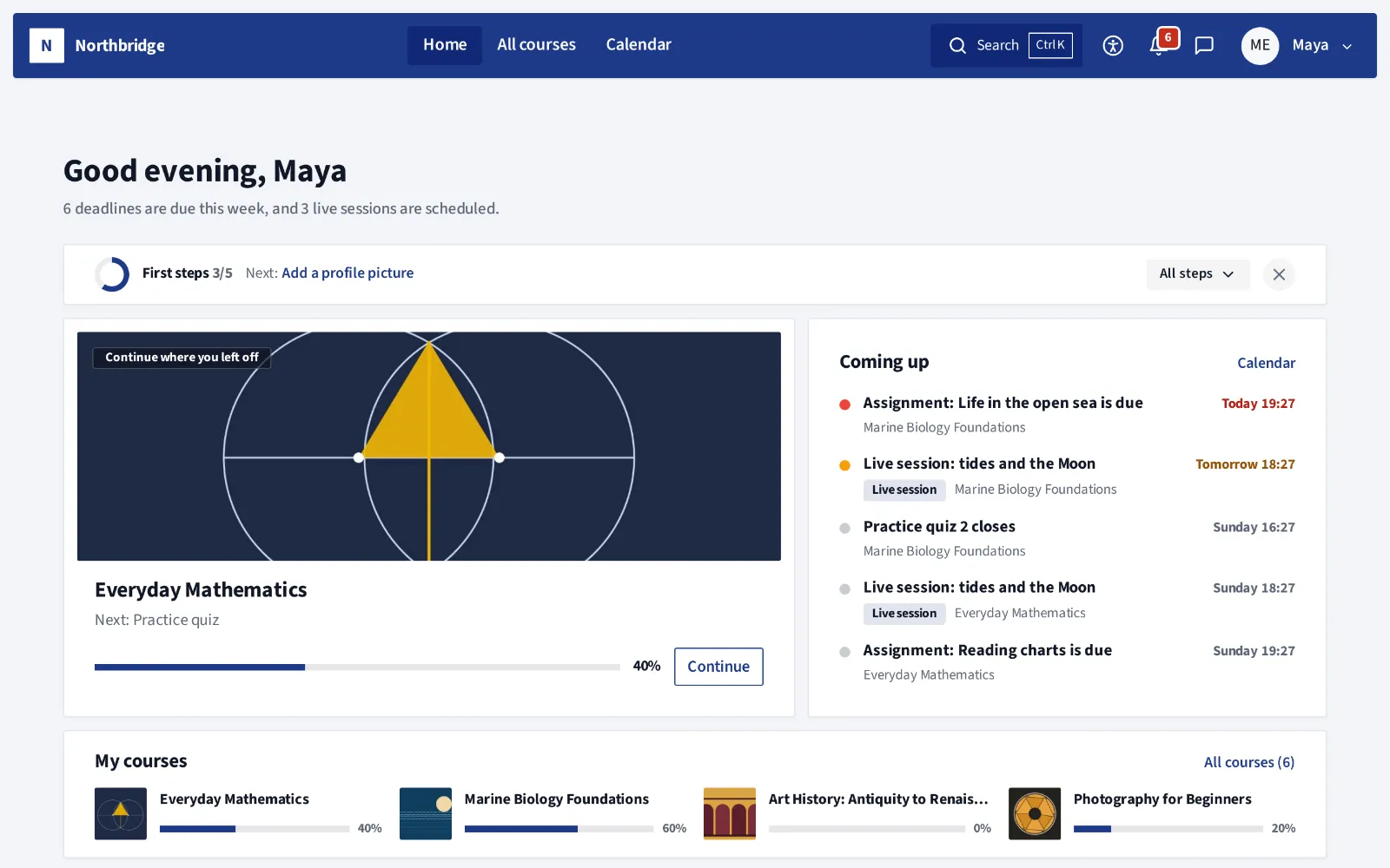
Corporate
White cards with a thin outline on a neutral grey, a denser layout, small corners and Source Sans 3.
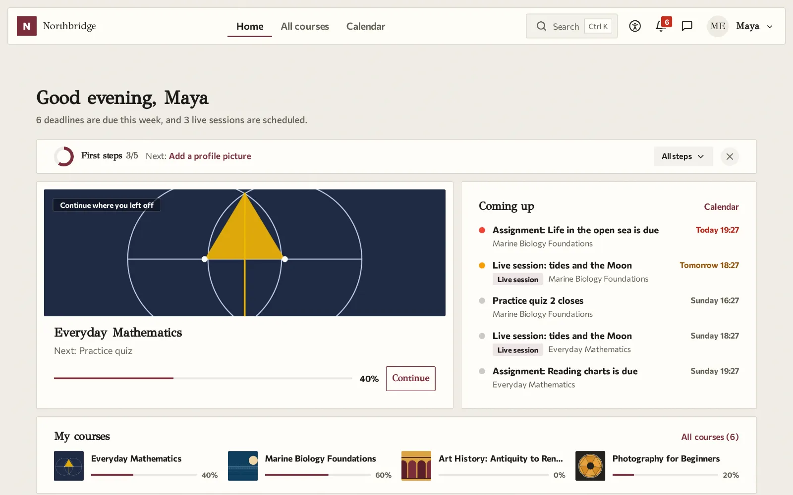
Paper
A warm paper background, serif GFS Didot headings, hairlines instead of shadows and square corners.
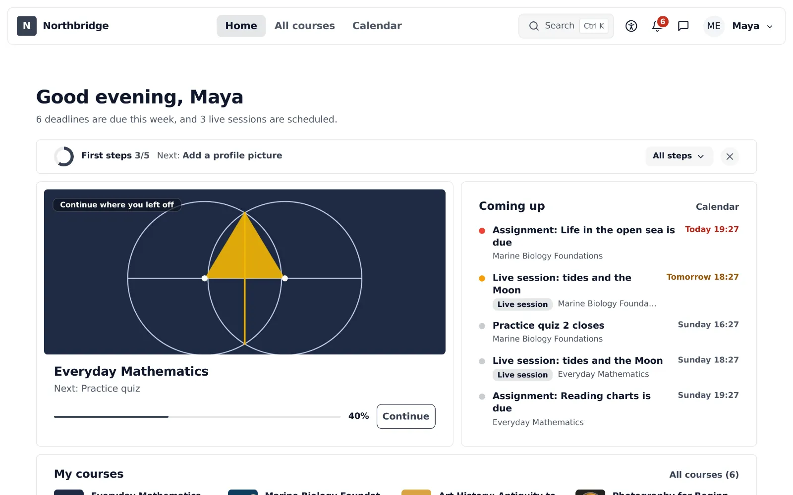
Clean
A white page without boxes, shadows or gradients, with the fonts of the device and nothing to download.
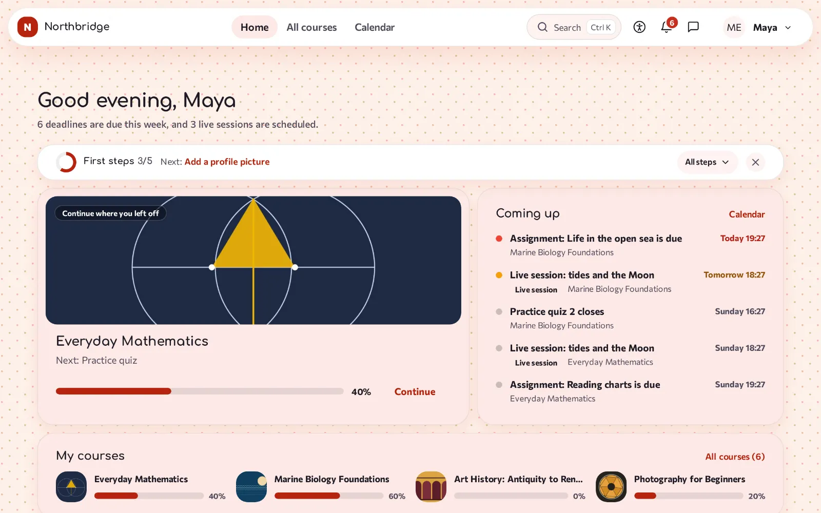
Lively
Soft tints of two colours, very round corners, rounded Comfortaa headings, larger buttons and thicker progress bars.
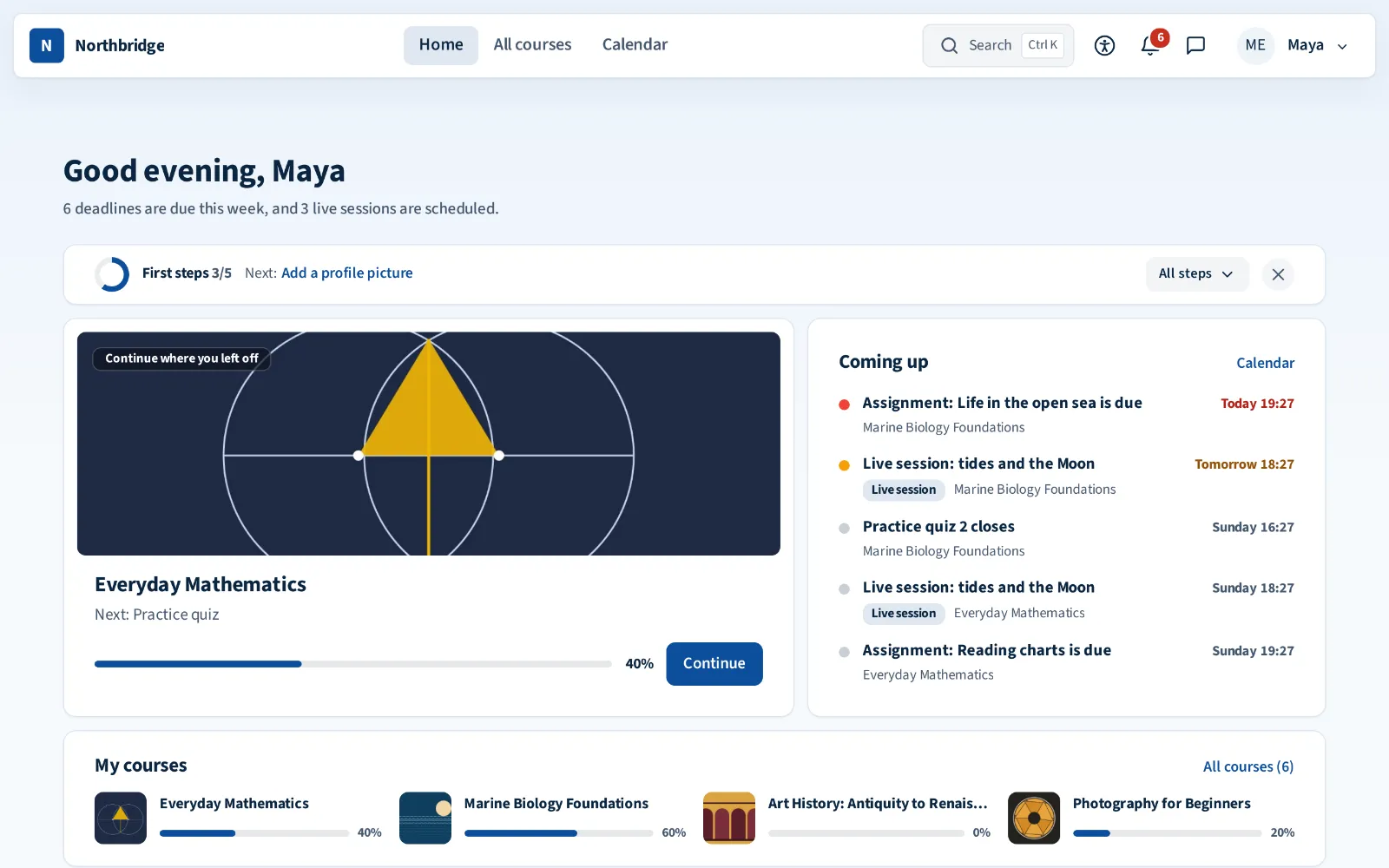
Aegean
White and deep blue with a lot of light, clean lines and soft corners.
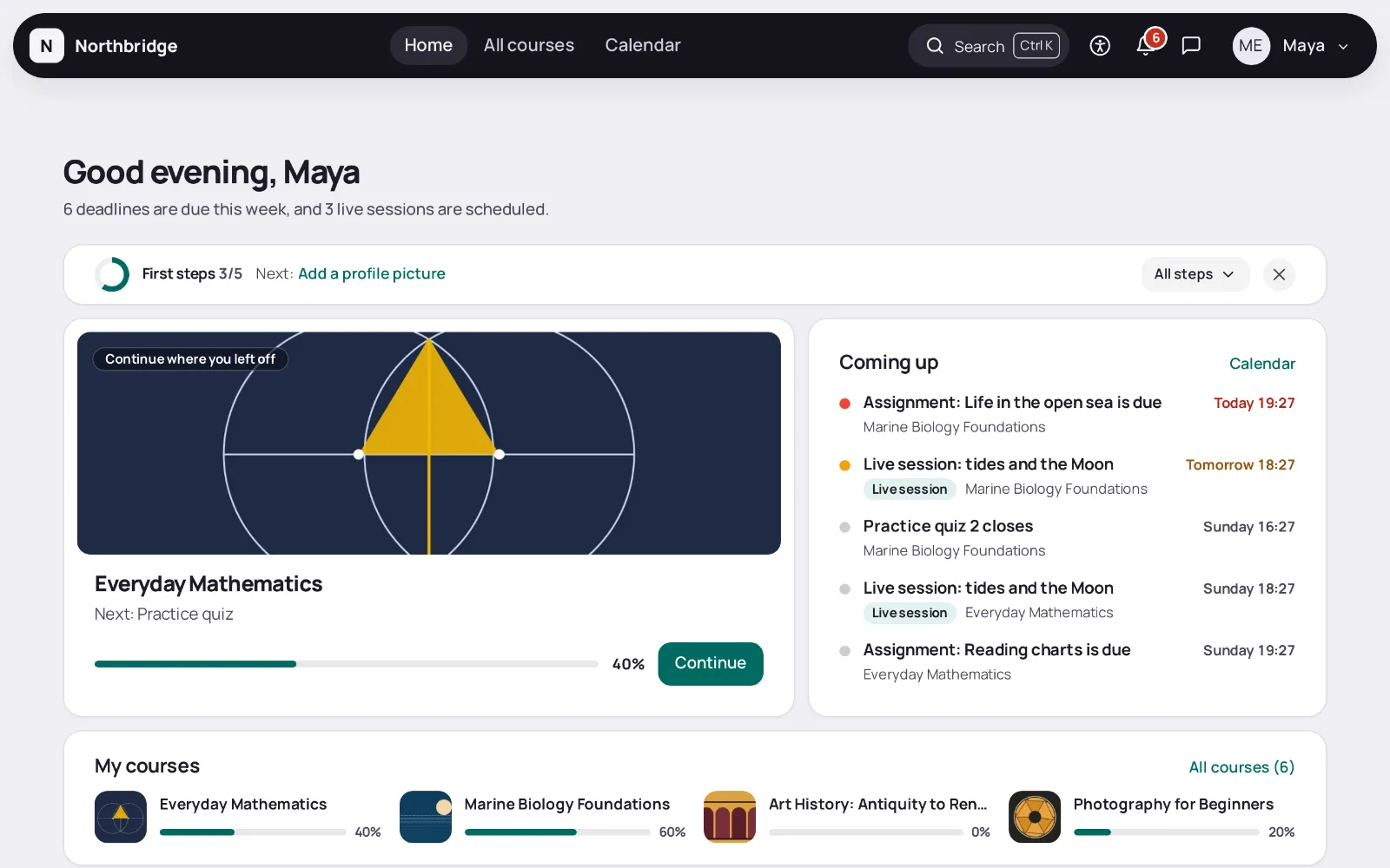
Night
Designed dark first: an almost black canvas with thin luminous lines. In light mode it becomes dusk.
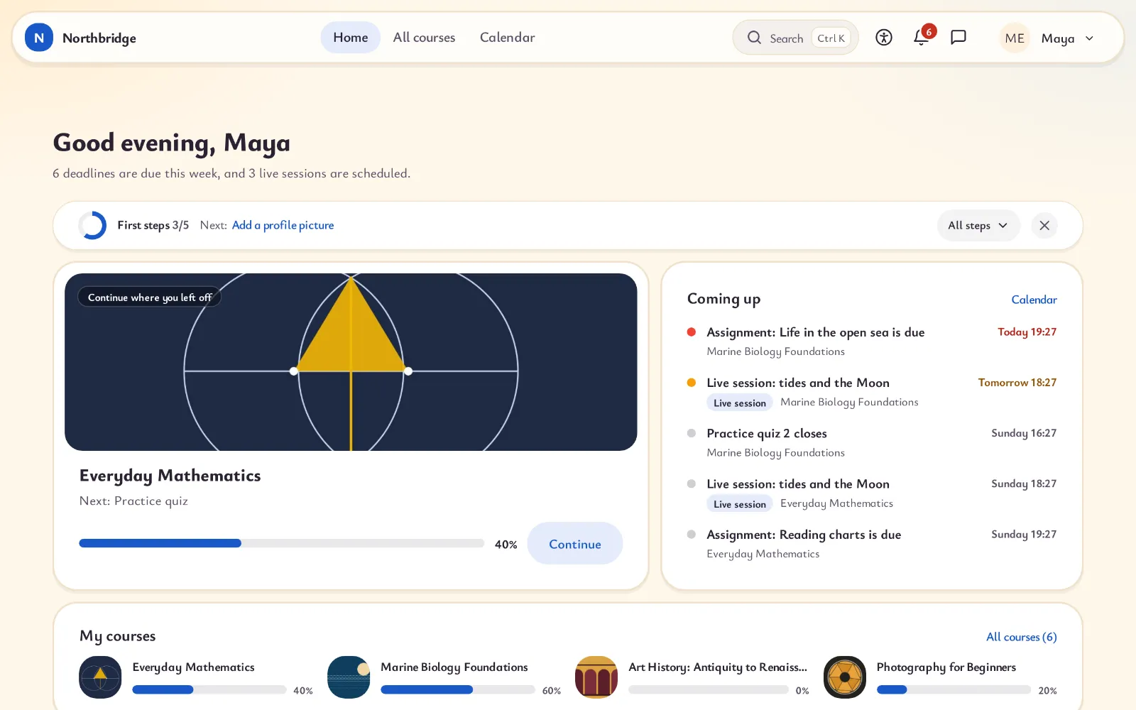
Chalk
The colours of a picture book and a friendly, easy to read font. In dark mode the page becomes a blackboard.
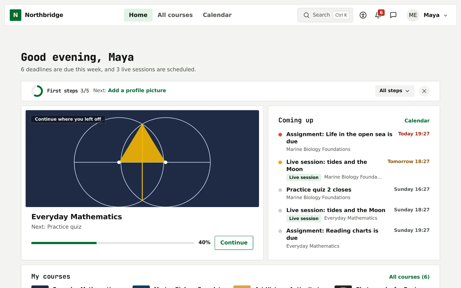
Terminal
A dark console with an amber accent. Only headings that are not clickable use a monospace font.
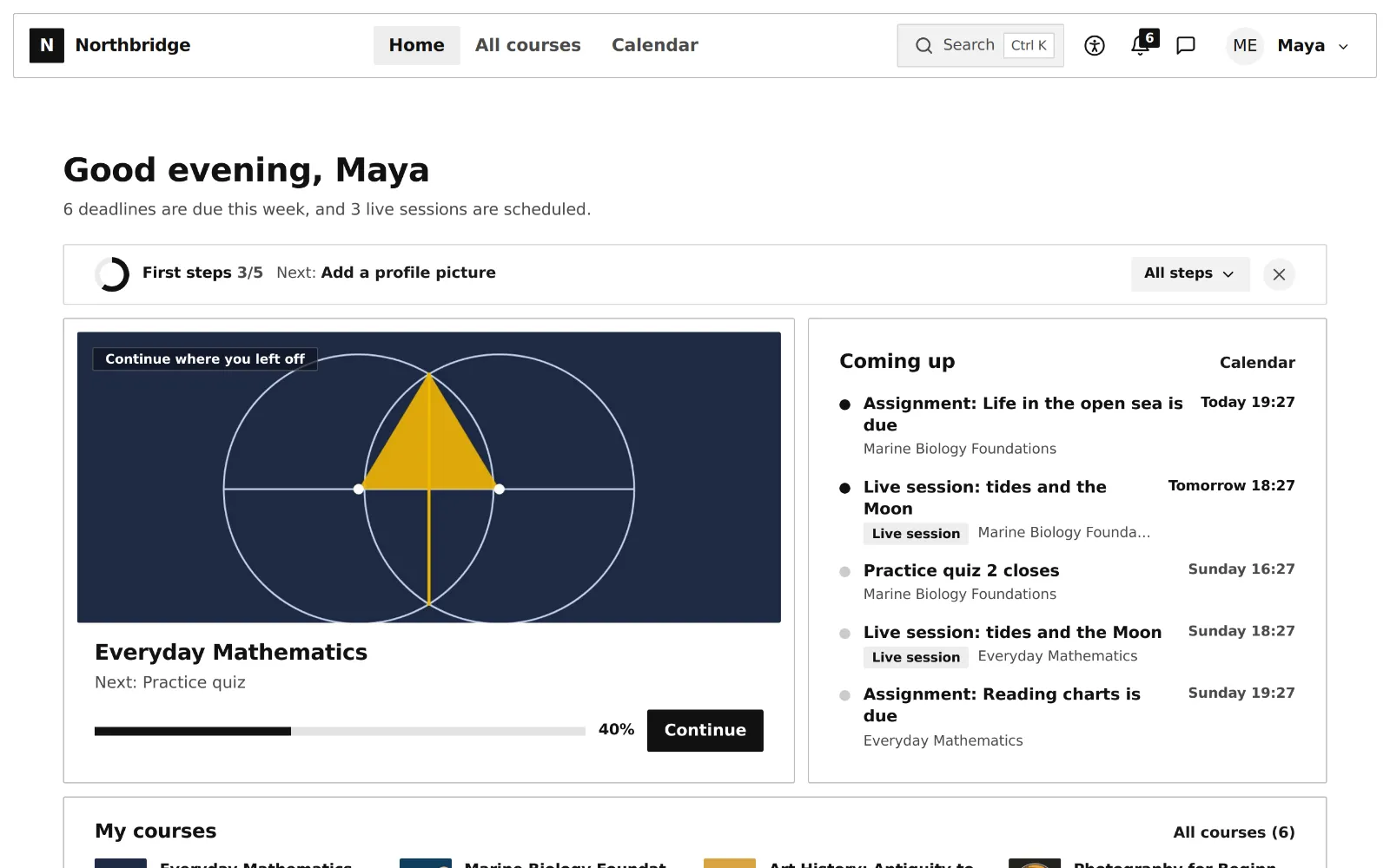
Ink
Black ink on white paper, no shadows, gradients or motion, so pages load fast on old devices and print cleanly.
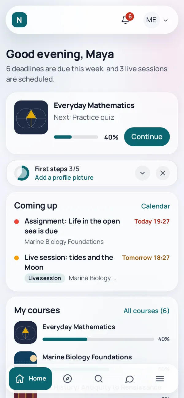
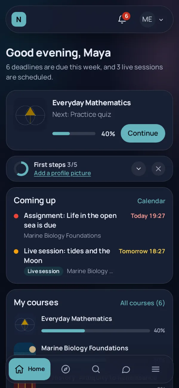
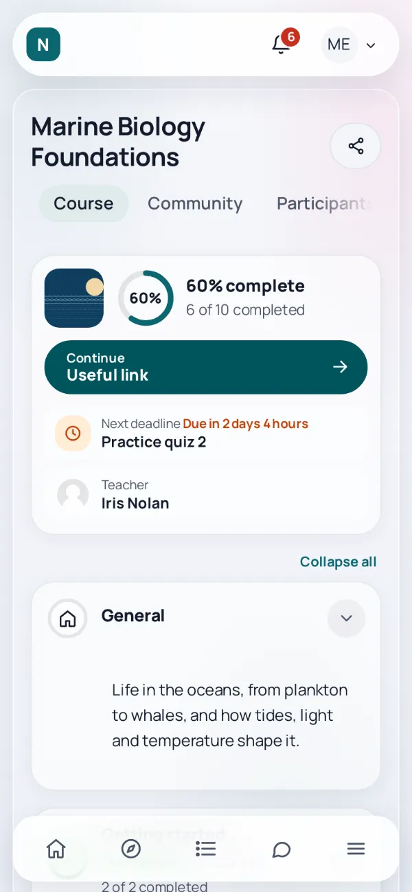
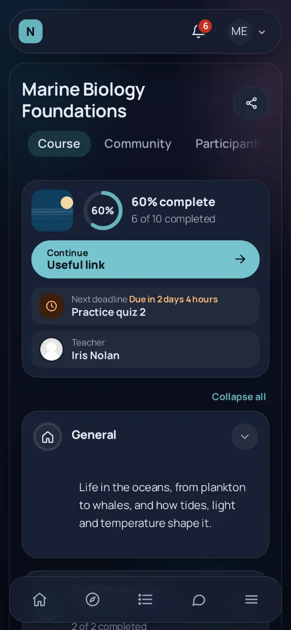
Made for the phone
Every shape works on a phone, with a bottom bar and a menu sheet, and young learners get four labelled icons.
Fine tuning without code
- Bars in light, brand or dark colours
- Buttons solid, tonal, outlined, ghost, text or bold
- Backgrounds plain, gradient, pattern or your own image
- Cards bordered, raised or flat
- Round, soft or square corners
- Comfortable, normal or compact density
- Five font pairs, all bundled with the theme
- Skins that change by date, and preview in your own session